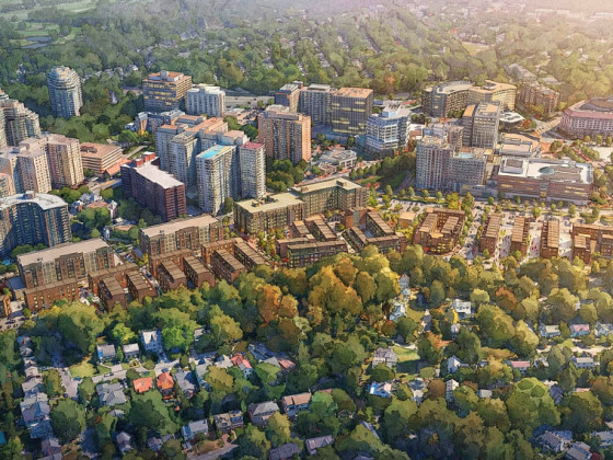
What's Hot: 134-Unit Residential Project Planned for Long-Vacant Chevy Chase Site on Connecticut Avenue
 Re-imagined: A U Street Row House
✉️ Want to forward this article? Click here.
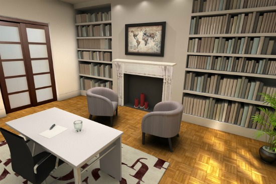
One of the re-imagined rooms at 1320 W Street NW
In a new feature debuting today called Re-imagined, Lori Steenhoek of Capital Pixel will help "re-imagine" what a DC home in need of renovations could look like one day.
There are some amazing features in the three-story row home at 1320 W Street NW (map) that we are featuring today, one just has to look for potential in the right places. Like most DC homes built around 1900, the property has great bones, but it needs a little bit of a facelift and some TLC. Take a look below at some of the before-and-after images to see a few of the ideas we’d suggest for renovations.
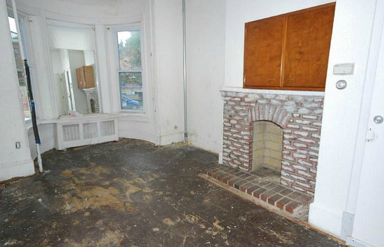
Currently: Deteriorating
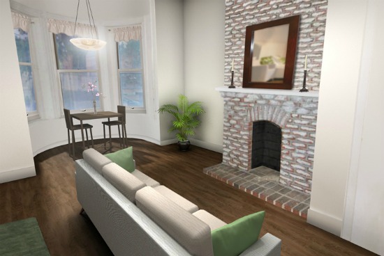
Re-imagined: A Room for Living
The Front-Bay Room
The front room of 1320 W Street NW is showing years of wear and tear. When we imagined what it could look like, the pipes and old radiator were removed from the bay window area, as were the misaligned cabinets over the fireplace. The first improvement was to buff and refinish the wood floors. The original fireplace brick was kept as-is, but new veneers were added to match the existing look. A fresh coat of paint and a hardwired lighting fixture above the front window were the final touches needed to make this room feel livable.
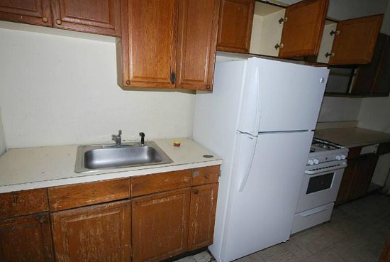
Currently: Dated and Dark
Re-imagined: Modern, Clean and Light
The Kitchen
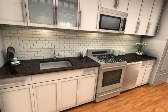
The kitchen needs a complete overhaul as the wood cabinetry is damaged and dated looking, and the floor tiles are peeling. The layout of appliances and cabinet heights are also in need of attention.
For the update, we’ve chosen to keep the overall linear layout and the location of the sink. By moving the refrigerator to the end of the line, we keep a more continuous countertop surface. Updated appliances, the addition of a dishwasher, new hardwood floors and counters, and white-paneled cabinetry provide for a lighter, modern-looking kitchen. A white, subway-tiled wall completes the transition.
Currently: Plain but spacious

Re-imagined: An intimate home office/reading room
The Bedroom (Turned Home Office)
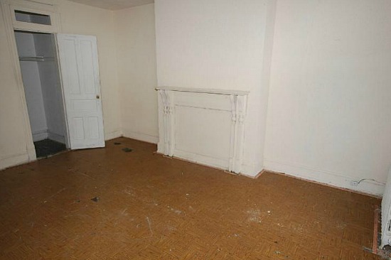
For a property with six bedrooms, we’ve decided it is necessary to turn one of them into a combination home office and reading room. The original detailing of the mantel and fireplace in the room above was kept intact and given a fresh coat of paint, and we opened up the central recess of the wall to make it look like a working fireplace once again. Flanking the sides, built-in bookshelves were installed to give plenty of room to store an entire library of books.
The original wood flooring was restored, and on the sidewall, the existing closet was made wider, and the swinging door was replaced with one of wood and glass that slides. Recessed pin lights were added above the fireplace and over the desk area, allowing the homeowner to choose between a brightly lit working environment and a more relaxed reading room ambiance.
Currently: Drab and muddy
Re-imagined as an urban retreat
The Backyard
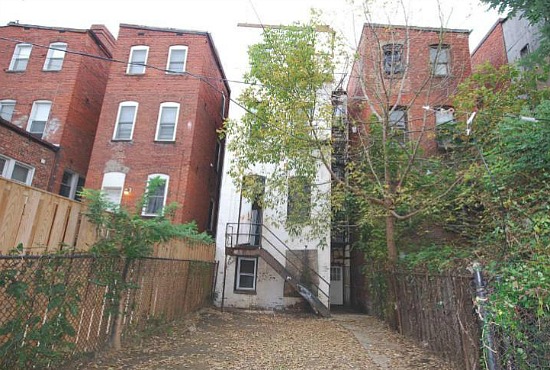
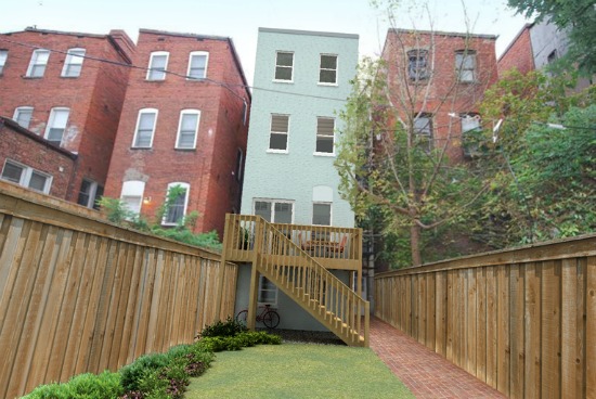
The chain-link fences in the backyard have to go, so we replaced them on both sides of the property with a higher wooden fence, providing more privacy and a cleaner edge to the lot. A new deck extends from the rear of the house, complete with a sliding glass door entry. Before, there was no occupy-able outdoor space, but the addition of this deck provides a great place to enjoy a cup of coffee in the morning or to host a BBQ with friends. For the length of the property, a red brick pathway extends to the rear gate, and new grass and landscaped plants add a bit of greenery. We trimmed some of the large branches from the neighboring tree, allowing more light into the rear windows and an open view of the backyard from inside. Finally, a fresh coat of neutral-colored paint freshens up the entire facade.
Lori Steenhoek is a Digital Artist with over six years of experience creating architectural renderings. She is the founder of Capital Pixel, a DC-based rendering company, and is currently finishing her Masters thesis in Animation and Visual Effects. She can be reached at lori@capitalpixel.com
Do you know of a home that needs some re-imagining? If so, drop us a line at editor2011@urbanturf.com.
See other articles related to: capital pixel, dclofts, editors choice, re-imagined, u street corridor
This article originally published at http://dc.urbanturf.production.logicbrush.com/articles/blog/reimagining_transforming_a_u_street_row_house/4409.
Most Popular... This Week • Last 30 Days • Ever

The former Washington Commanders owner's 16.5-acre estate is set to return to the mar... read »

Cash-out refinancing is a popular financial strategy that allows homeowners to conver... read »
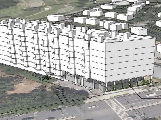
A dormant stretch of Connecticut Avenue in Chevy Chase may soon see new development.... read »
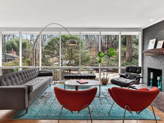
In this week's Above Asking, we feature a mid-century modern home in Alexandria that ... read »

The greater DC luxury housing market's most expensive recent sales in 2026 span the f... read »
- Dan Snyder's River View Estate To Return To The Market For Just South Of $50 Million
- How Does Cash-Out Refinancing Work?
- 134-Unit Residential Project Planned for Long-Vacant Chevy Chase Site on Connecticut Avenue
- Above Asking: A Bit Of A Premium In Hollin Hills
- Halcyon To Horse Farm: The 3 Most Expensive Properties Sold In The Greater DC Area In 2026
DC Real Estate Guides
Short guides to navigating the DC-area real estate market
We've collected all our helpful guides for buying, selling and renting in and around Washington, DC in one place. Start browsing below!
First-Timer Primers
Intro guides for first-time home buyers
Unique Spaces
Awesome and unusual real estate from across the DC Metro


