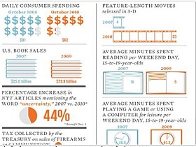
The Atlantic: How the Recession Changed Us
In what is perhaps the coolest collection of statistical graphics we have seen in the past 12 months, The Atlantic has an "infographic" in its latest issue that compares a number of economic metrics pre and post-recession.